A living history of the LGBT movement
Client: AARP
Agency: NextDayBetter
Impact & Results:
Cultural proof: Featured by educational institutions (e.g., Santa Fe Community College, Tacoma Community College, SUNY Plattsburgh), cited in newsletters (Washington State Department of Children & Youth), and surfaced by third-party press (Human Rights Campaign, Palabra NAHJ).
Audience reach: YouTube 161K views with ≈2.0% like rate (3.1K likes ÷ 159K views); Facebook 79K views.
Industry recognition: Adobo Design Awards Asia (Gold—Video Graphics, Silver—Typography); AAF Mosaic recognition; exhibited in LOOK HERE: Women in Graphic Design (Manila).
Chapter Breakdown & Thematic Intent
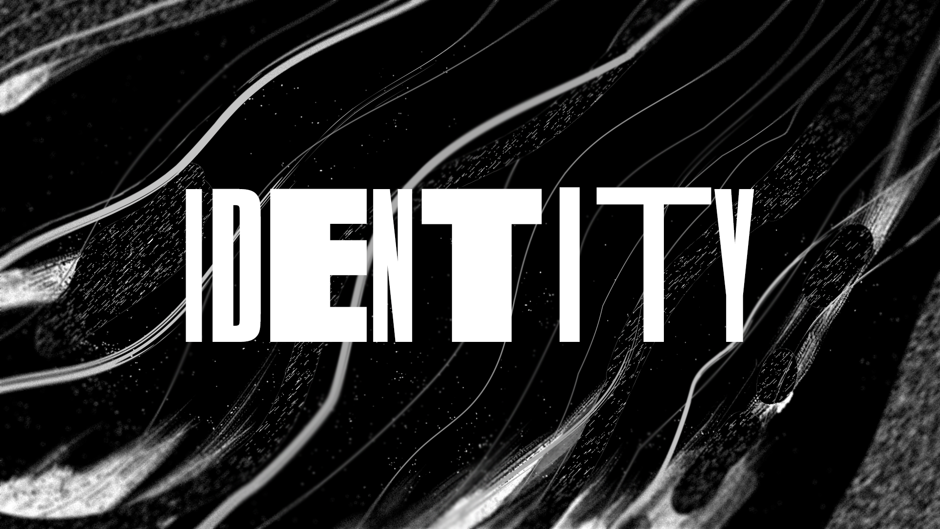
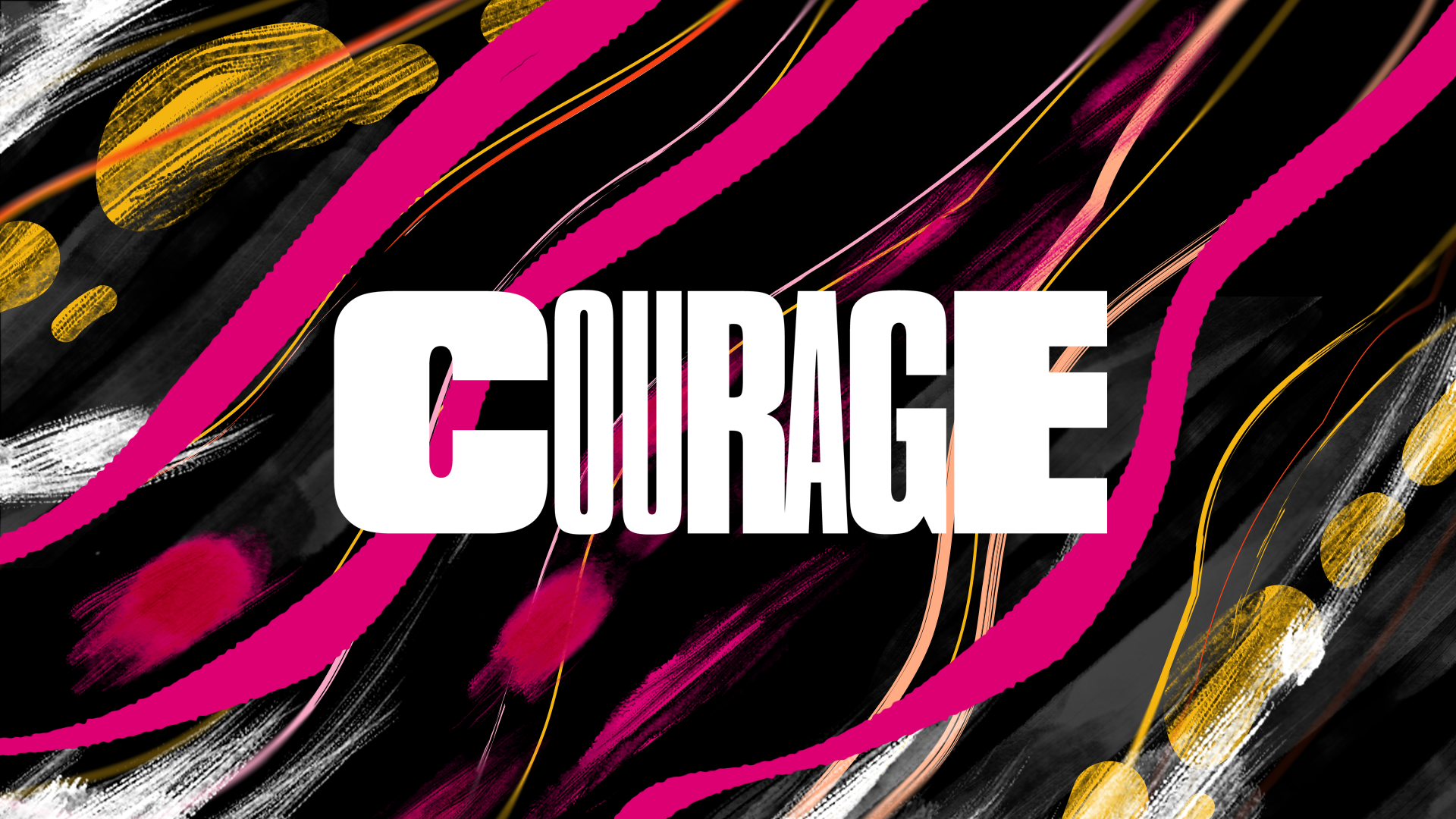
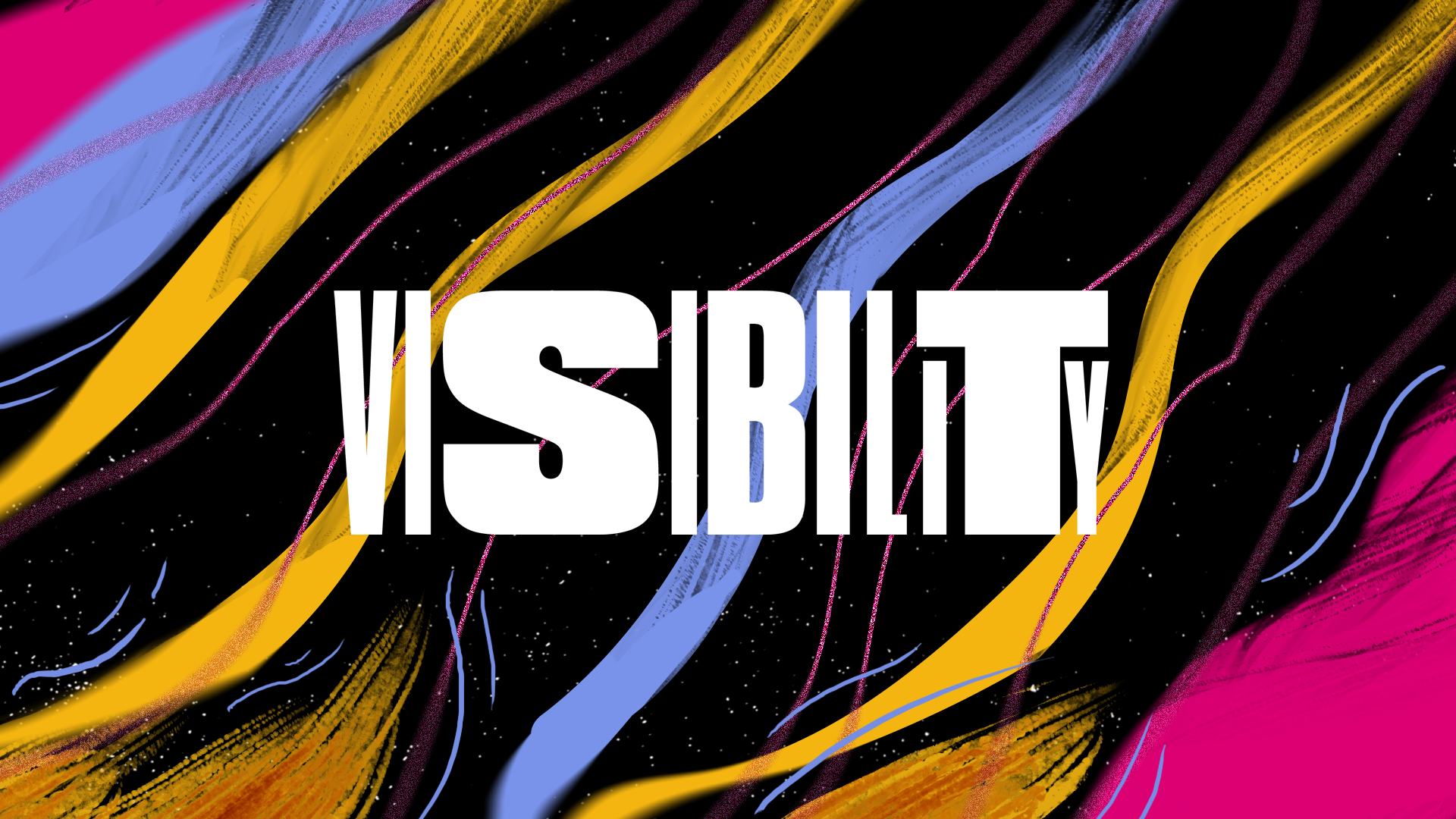
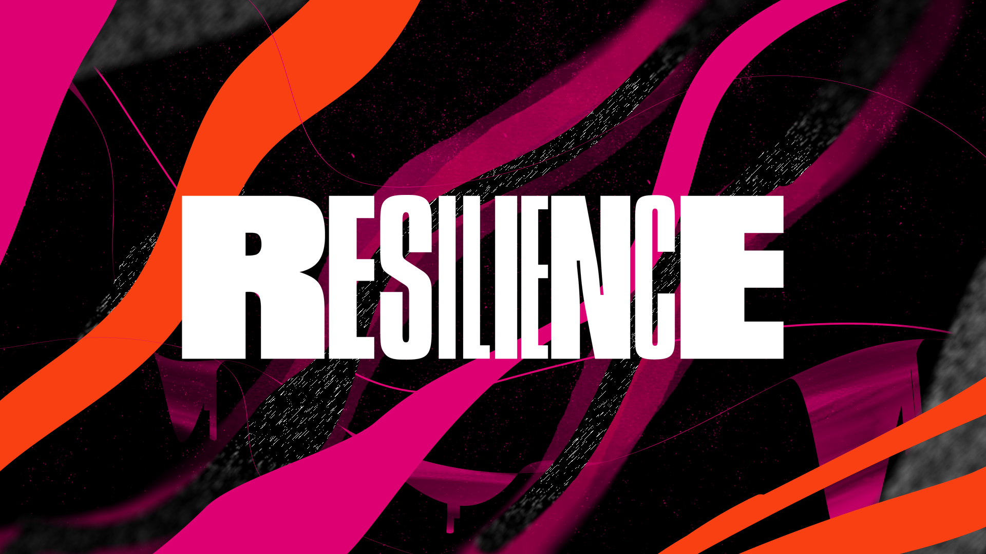
01
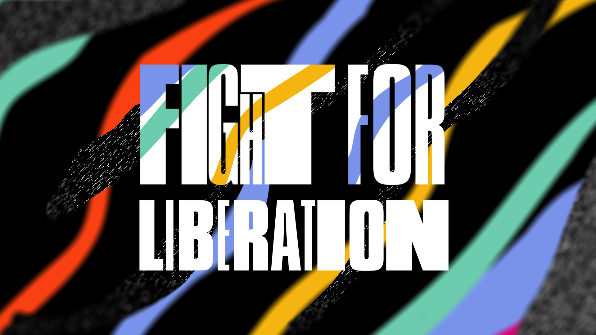
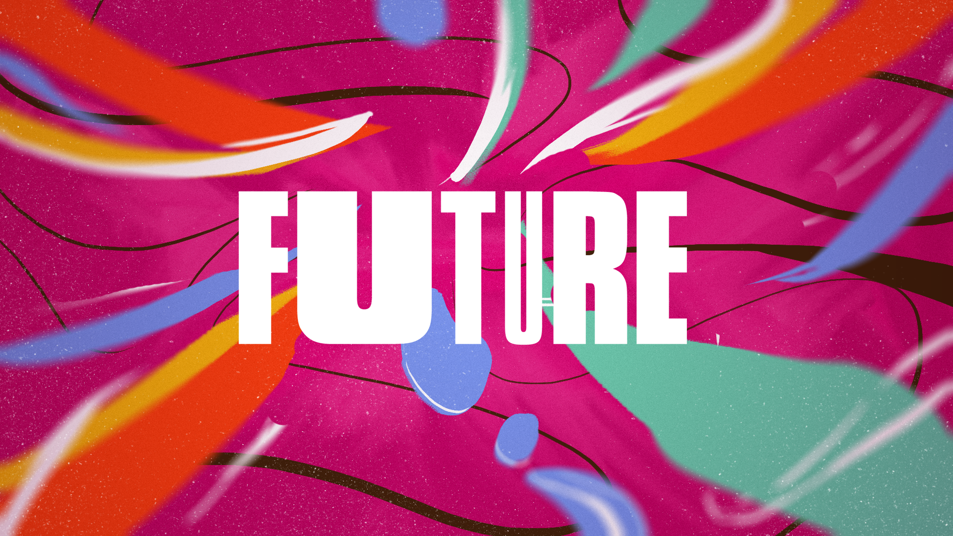
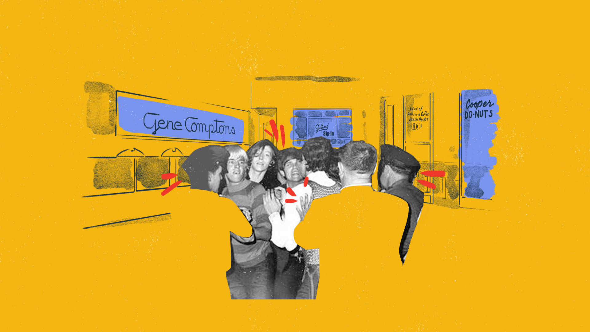
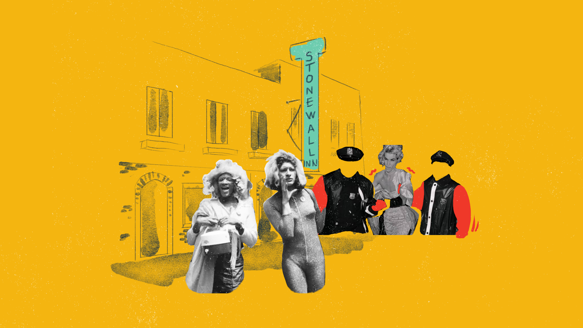
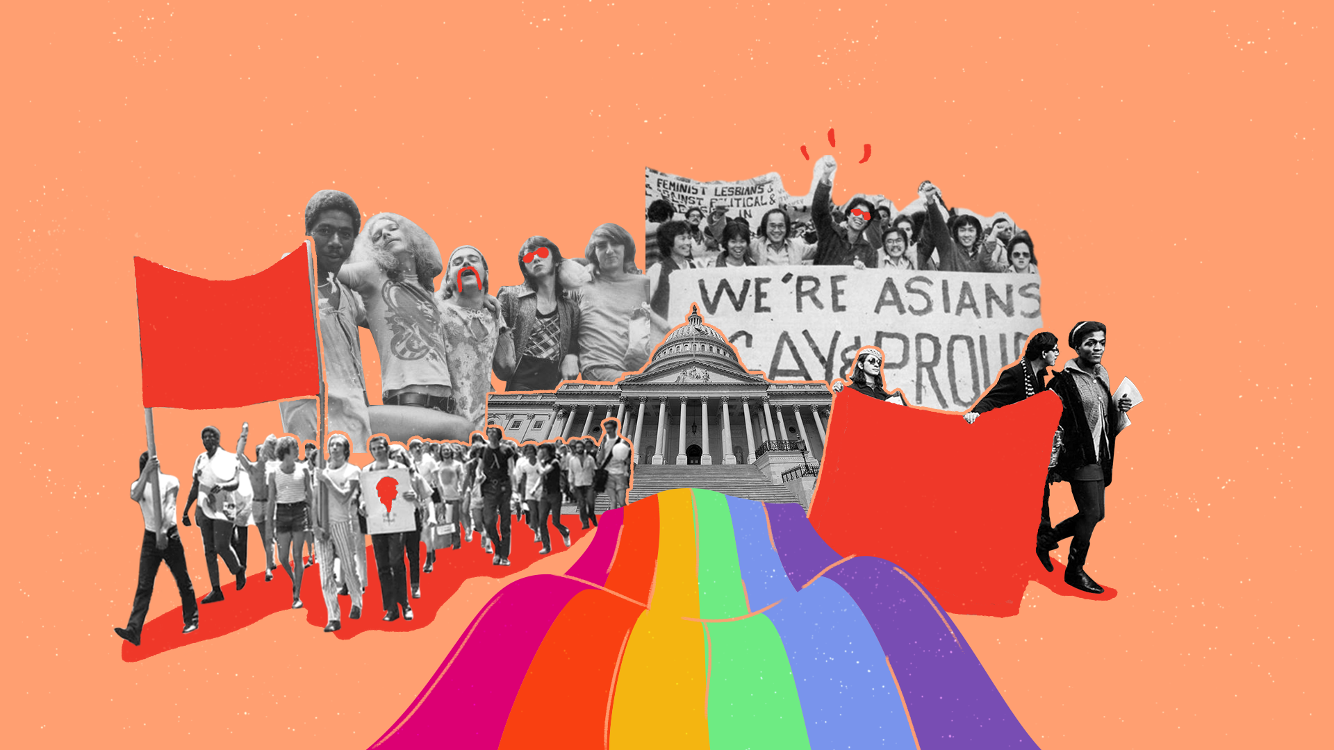
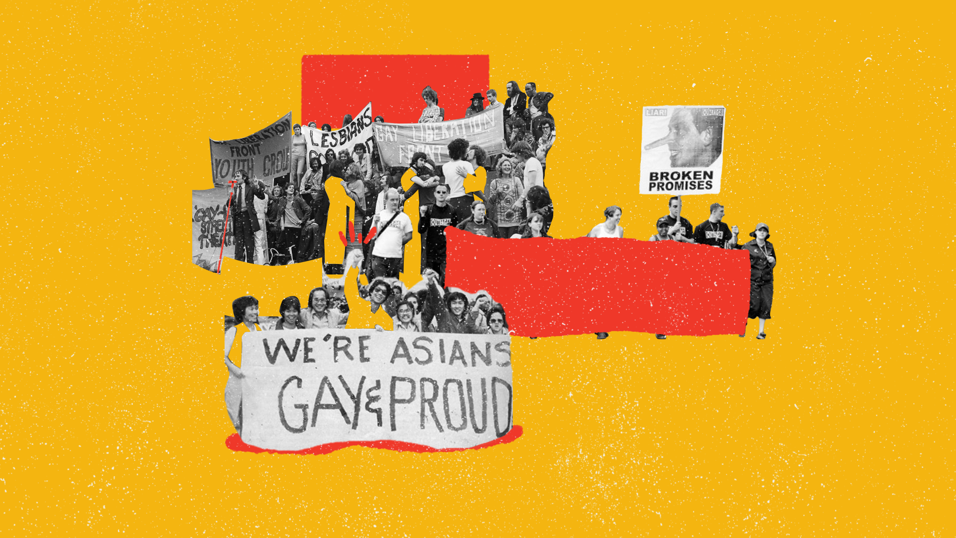
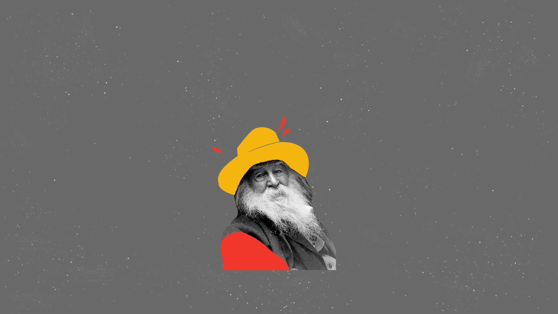
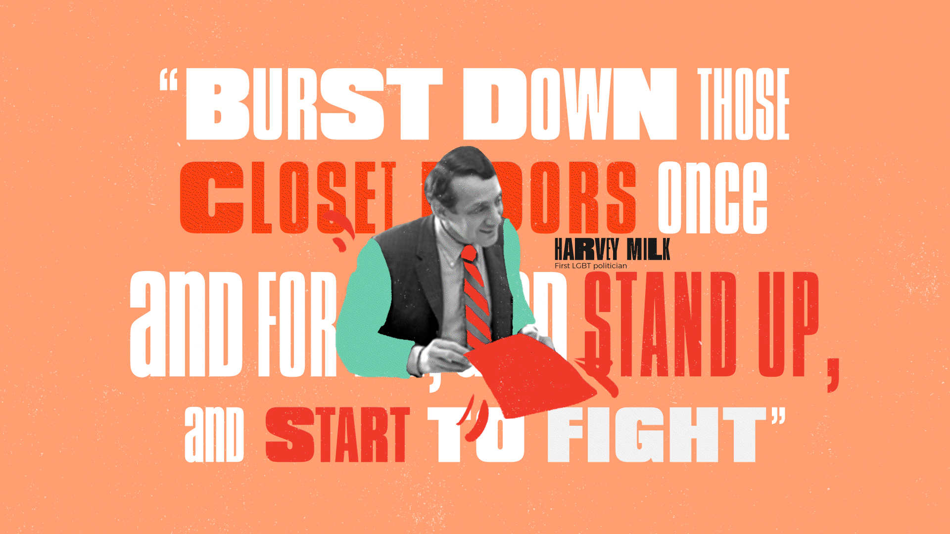
The narrative is structured into six chapters that trace the LGBTQ+ movement from secrecy to celebration—and the ongoing fight ahead. Starting with Identity (early figures like Walt Whitman creating safe spaces), moving through Courage (building visible communities), Visibility (Stonewall and public uprising), Resilience (surviving the AIDS crisis), and the Fight for Liberation (marriage equality and legal protections), before landing on The Future—a call to action acknowledging that progress is fragile. I wanted each chapter to flow into the next like generations passing the torch, making complex history feel less like a textbook and more like a living story of survival and hope.
Character Design
02
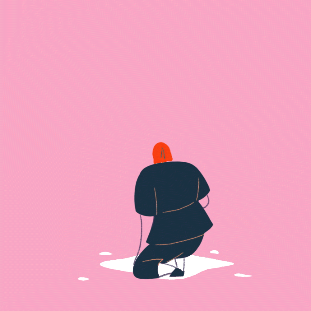
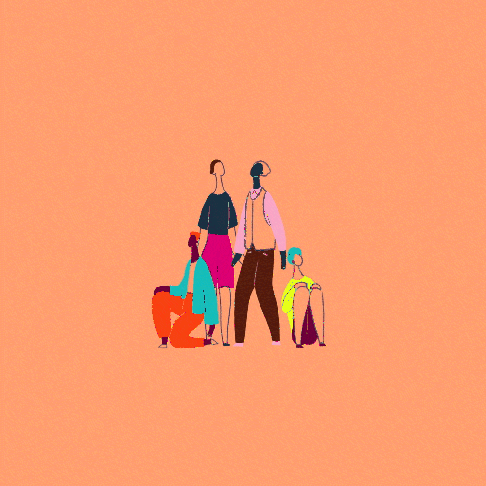
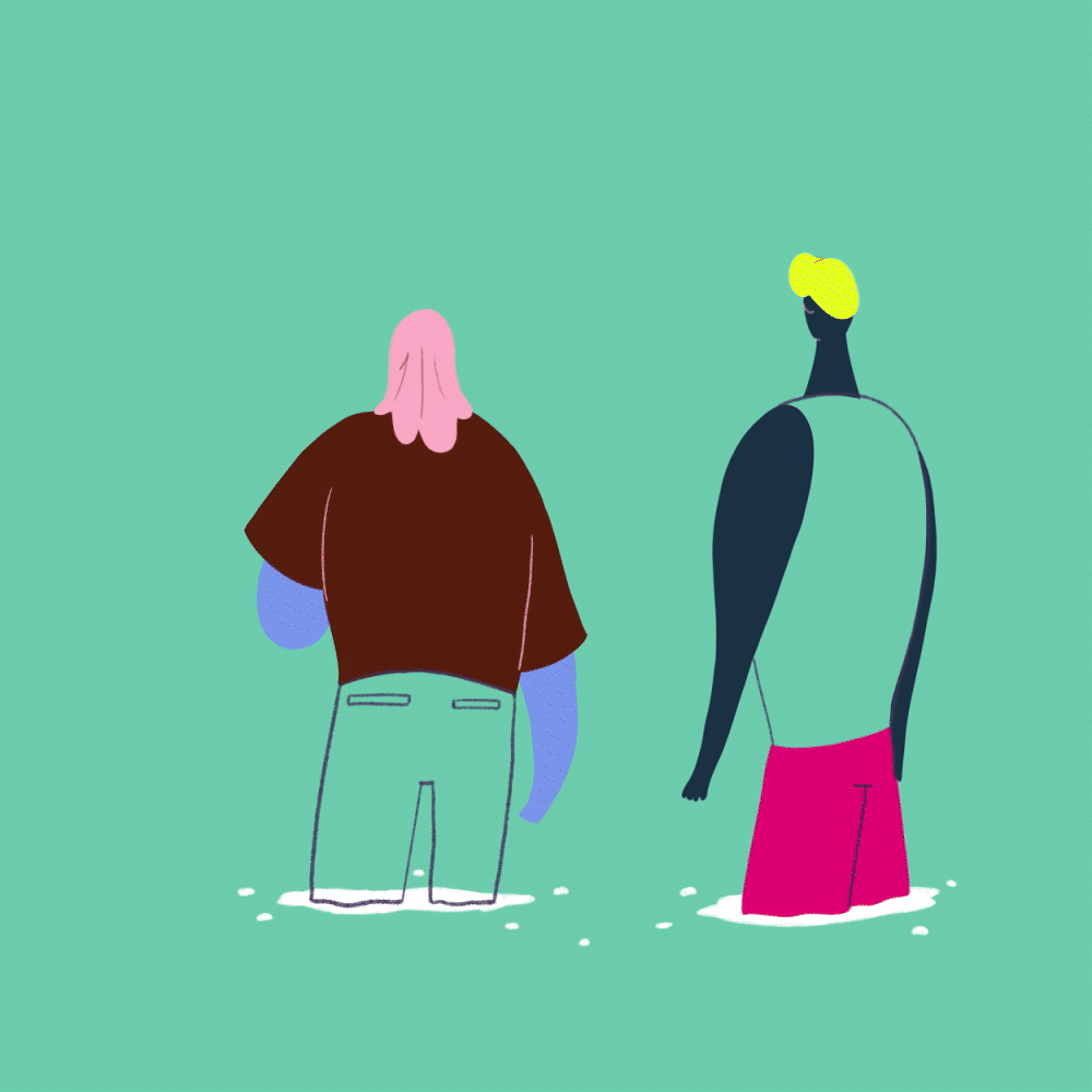
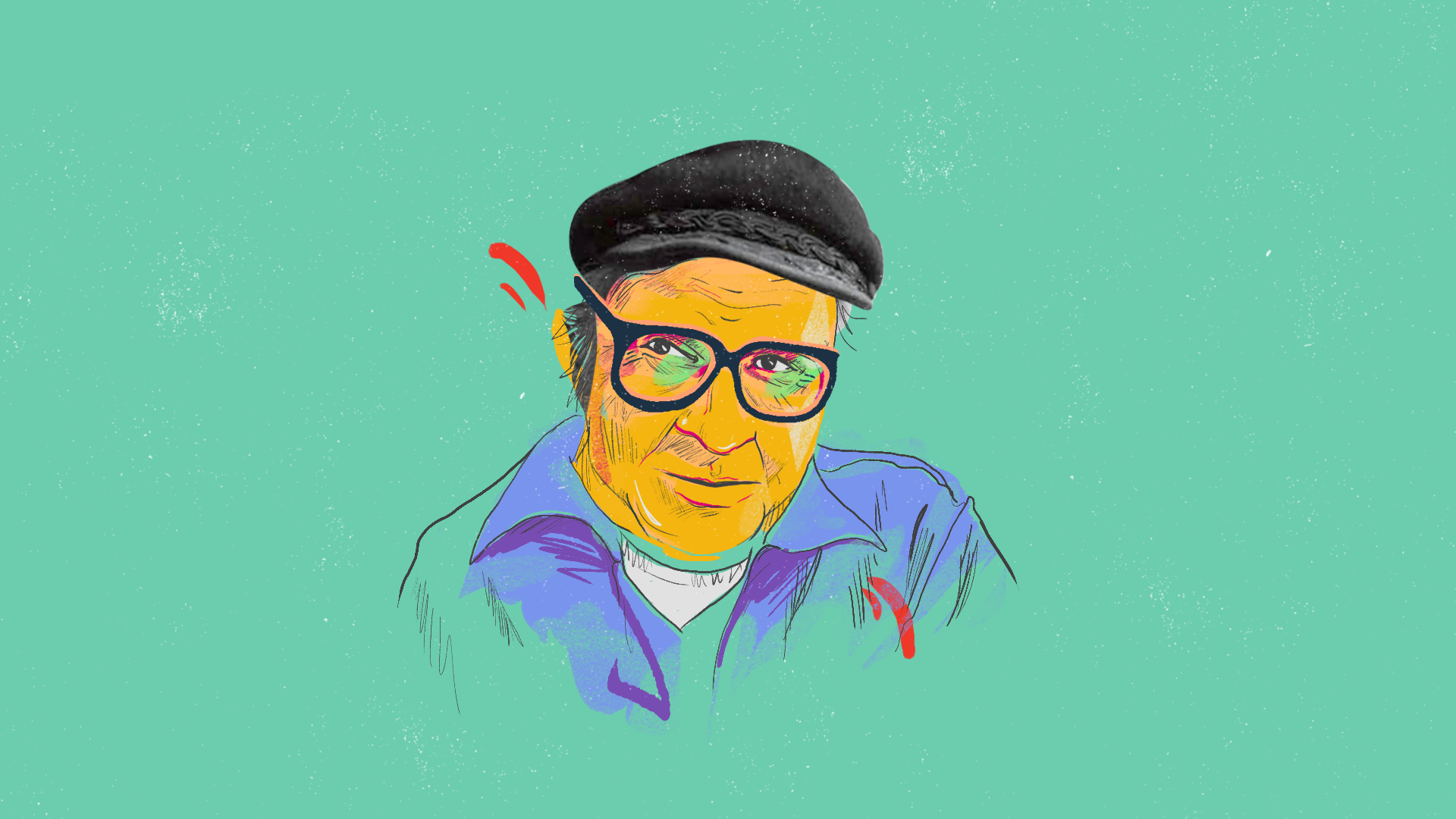
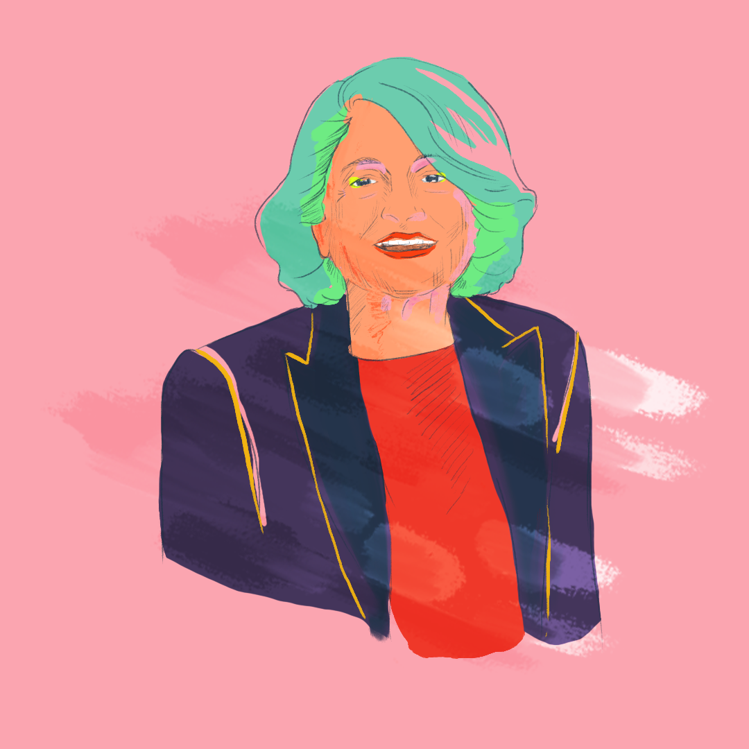
For "The Living History of the LGBTQ+ Movement," I led the creative direction toward a stylized, metaphor-driven approach where characters could morph and evolve across generations. I wanted simplified forms that could shift between moments of struggle—silhouettes running, hiding—and moments of connection and community.
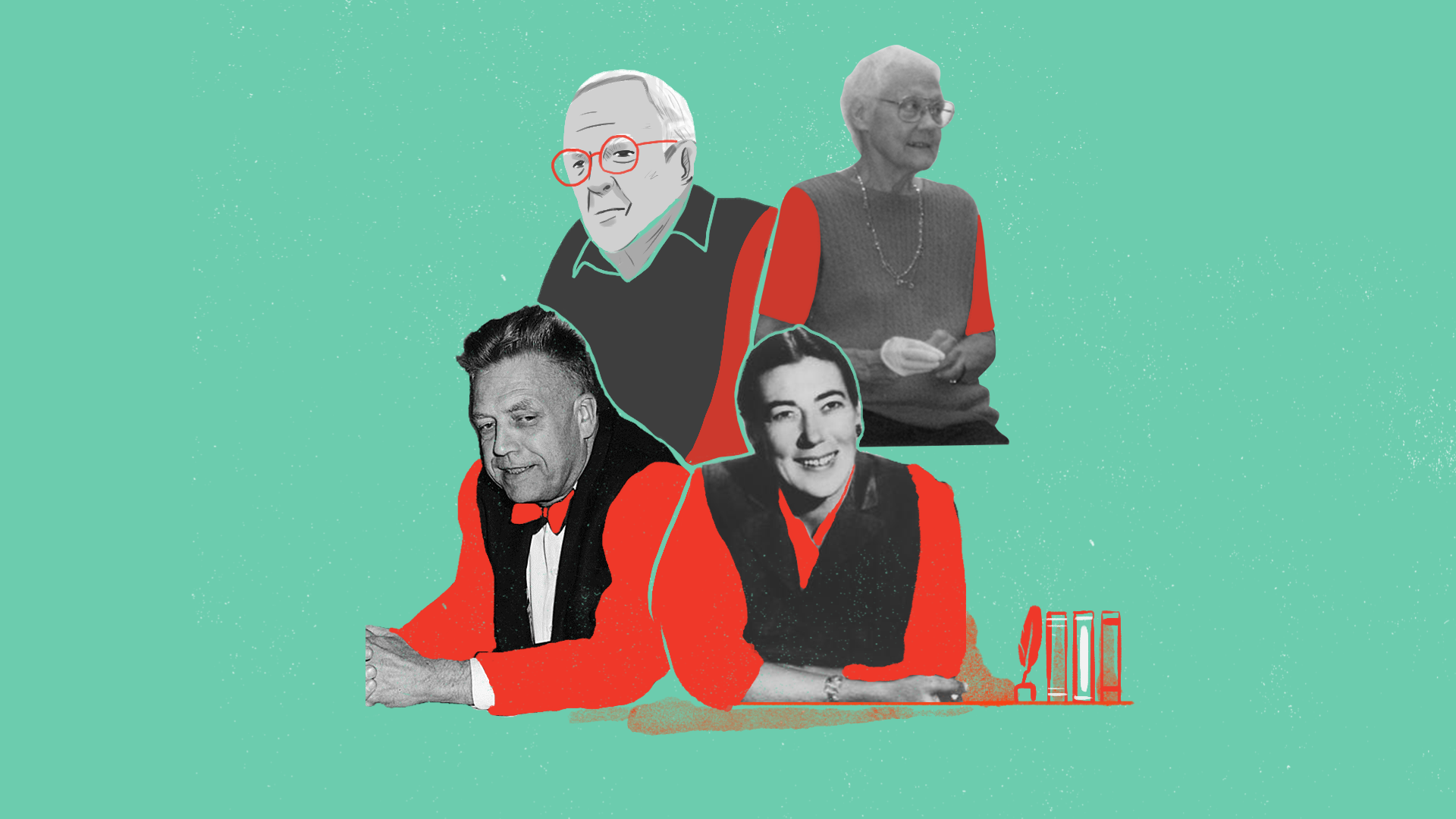
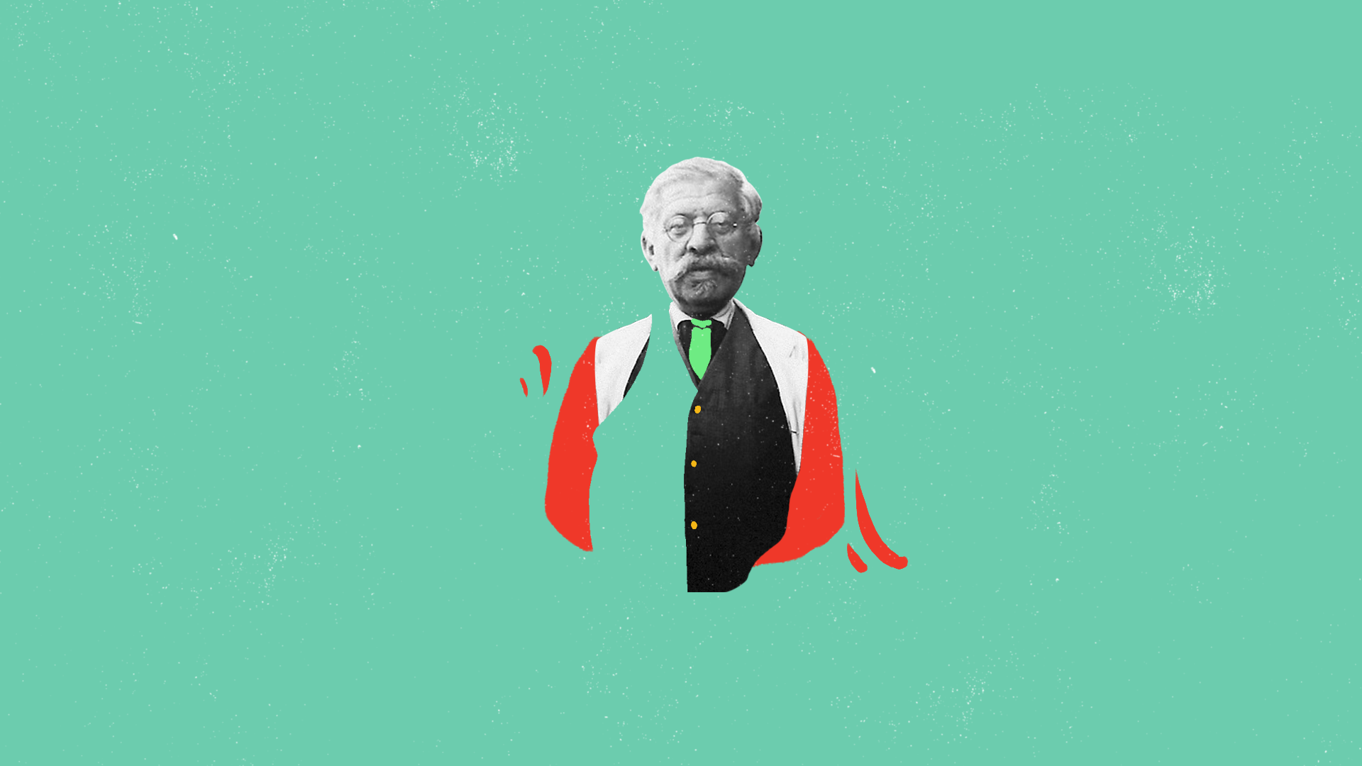
The vision centered on using bold, sunset-warm colors and letting the design itself become a metaphor for gender fluidity and transformation. When honoring historical figures like Walt Whitman or Magnus Hirschfeld, I directed the team to blend recognizable features with our abstract style, ensuring each era felt both distinct and connected to the larger story of resilience.


Images & Photography
03
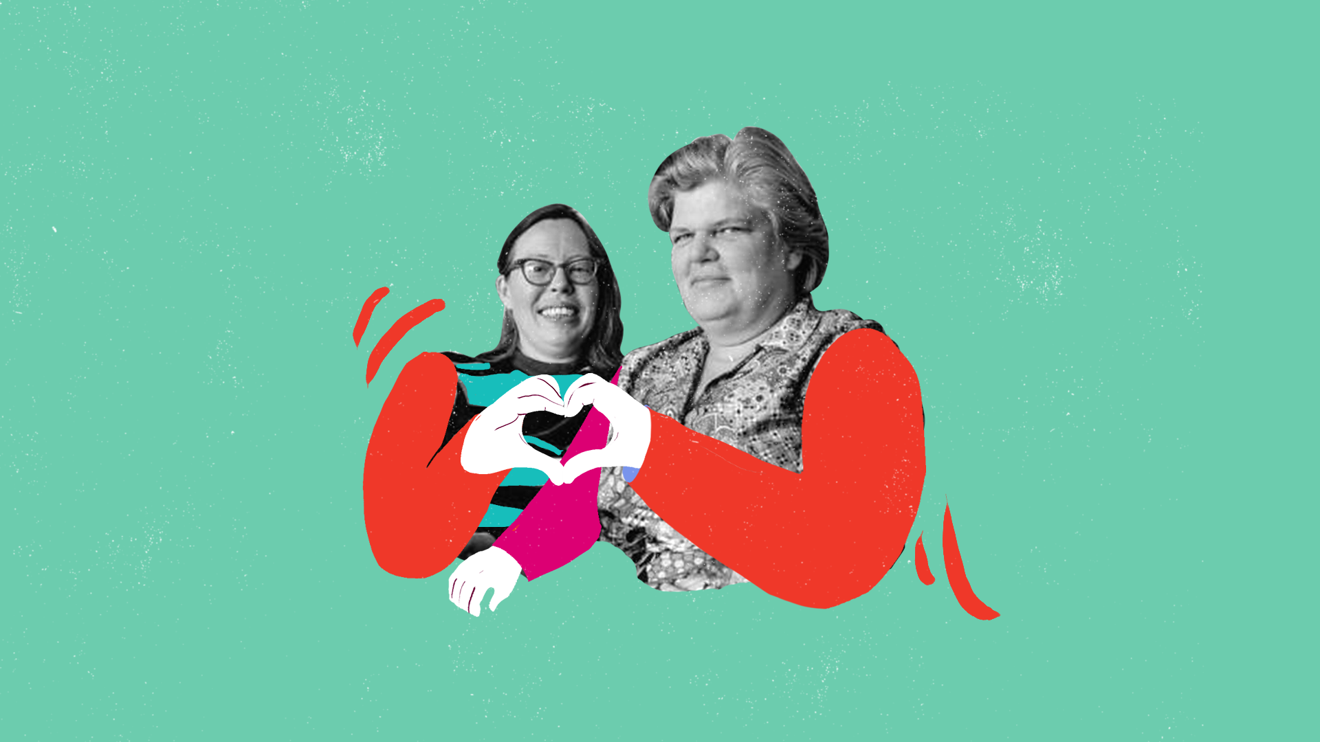
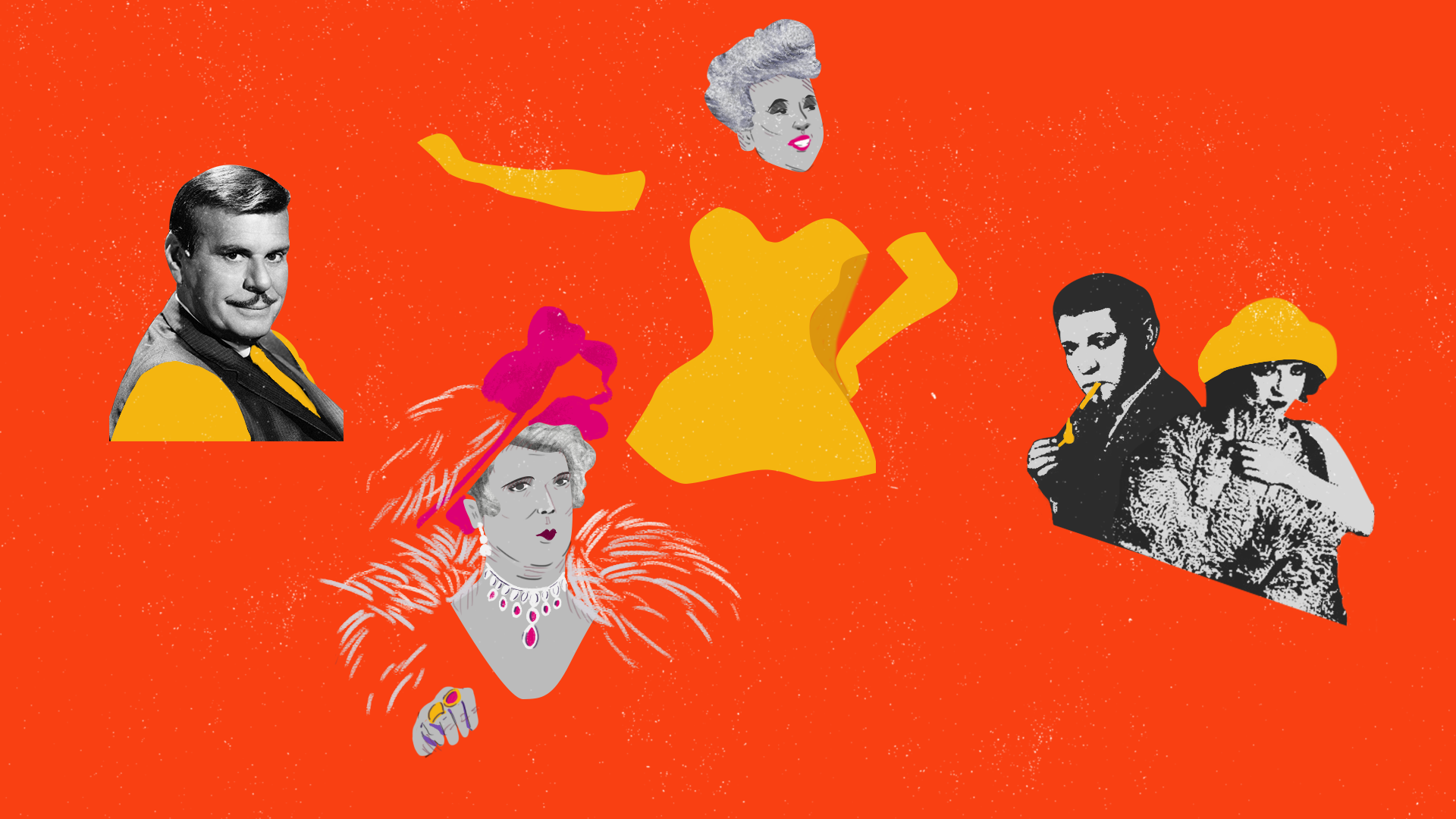
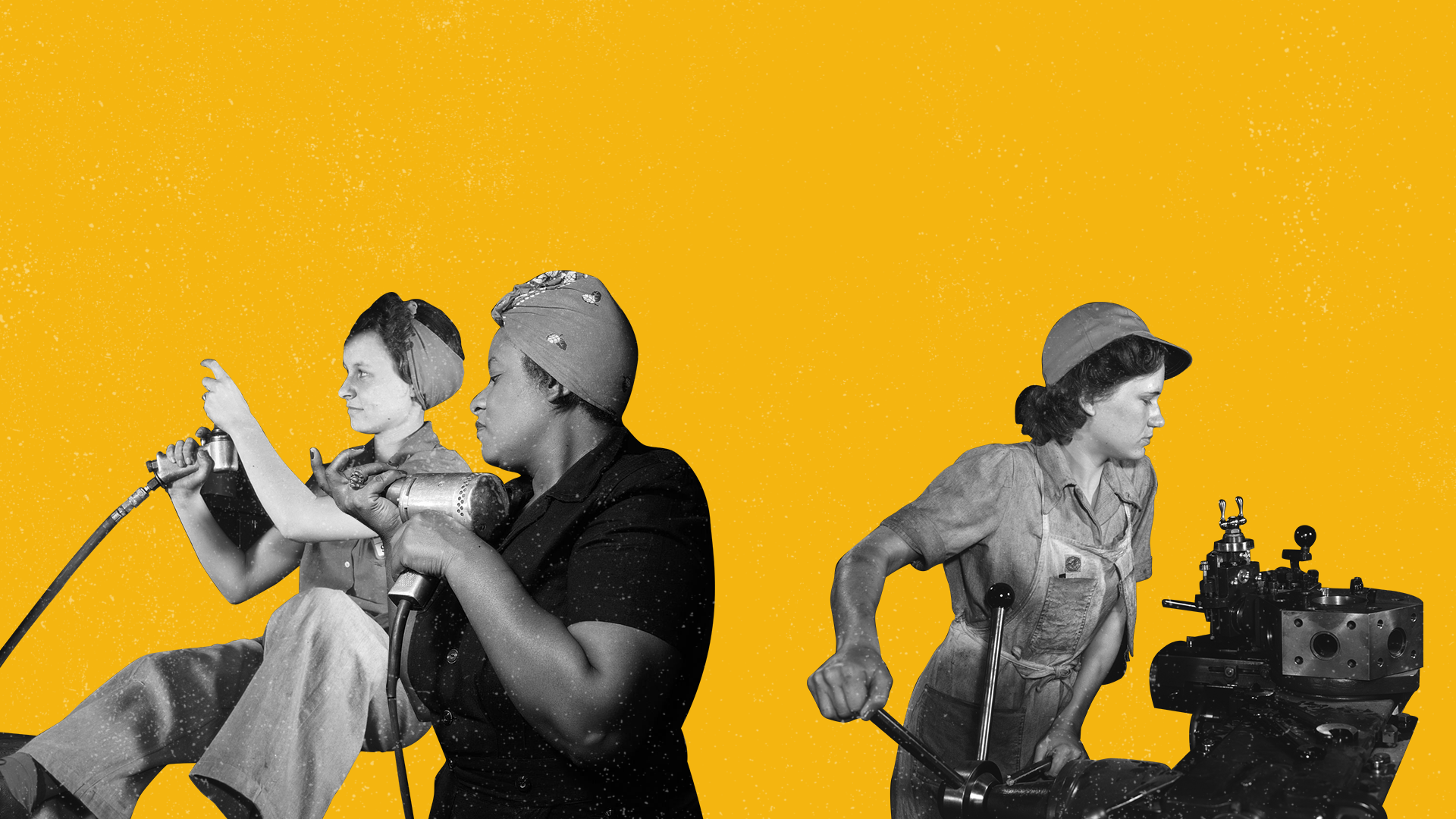
The creative direction toward a kinetic, mixed-media aesthetic—blending collage, bold typography, and stylized illustration to make centuries of history feel vibrant and alive. The vision centered on visual metaphors: warm, sunset-toned palettes, abstract textures, and simplified character forms that could morph across eras. For historical figures like Walt Whitman or Magnus Hirschfeld, I directed the integration of illustrated portraits onto stylized bodies, weaving archival elements into our contemporary style. Every visual choice—from swirling chapter titles to composite closing shots—aimed to transform complex struggle and resilience into something that felt urgent, caring, and unmistakably human.

Typography
Contrasted by bold urban texts, rough textures, strong layouts and framing. These will represent being informative, resistant and challenging the norm.
With a font like Compacta, we get a versatile font that has a strong modern character. Complemented by Mont Light, for bodies of texts.

Color Palette
We especially love seeing colorful rainbow flags that symbolize the community so we want to keep the video as bright and colorful as what have previously been done, and elevate from that.
Although we show the full spectrum, the piece will dominantly play around the warmer tones like a vibrant afternoon sunset.